Michel Rabagliati never disappoints me. I thoroughly enjoyed reading his latest book, *Y a d’la joie*. The author starts off strong with a few drawings that speak volumes about the influence of the media today. Then he lets us into his life by taking us on a tour of his neighborhood in Montreal. I particularly enjoy the true stories, as they possess an intensity I don’t find in works of fiction.
Here’s a quick aside: while reading Mr. Rabagliati’s book, I was passing through Montreal and took a few photos, including one of the city with the lilacs in bloom.

And since the Montreal Canadiens were playing a game that evening that would later eliminate the Buffalo Sabres, it was a must to capture the city’s buildings lit up in red, white, and blue.

Now back to the book. The author presents us with an uncensored Montreal—the one you don’t see on postcards. He rightly rails against the idiots who deface the beautiful murals in his neighborhood and elsewhere in the city. Fortunately, there are still buildings where the artwork remains intact, as shown in the two photos below.


Mr. Rabagliati introduces us to the businesses in his neighborhood, the people who work there, and those he deals with on a regular basis. He stops by to say hello to his daughter and reminisces about the good times. I love the book’s slow pace and its human touch. His style and words remind me of the Icelandic author Auður Ava Ólafsdóttir.
In short, a superb book that lets us catch our breath a little and reconnect with life bit by bit. If you’d like to see the author in his daily life, you’ll enjoy “Y a d’la joie.”
Click on the link for more comics and graphic novels as well as for photos of the province of Quebec on my blog.
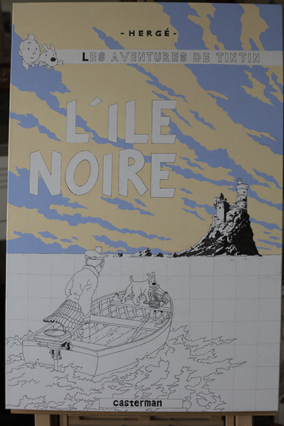
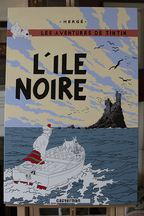
Author: Michel Rabagliati
Title: Y a d’la joie
Publisher: La Pastèque, 2026
ISBN: 978-2-89777-210-9