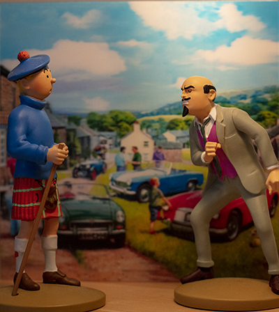
In the photo above, you may have recognized Tintin dressed as a Scotsman as he faces the evil Dr. Müller. These two characters are from the comic book Tintin and the Black Island. A majority of French speakers probably read this album in their youth. And, even as adults, some of us (myself included) have revisited this work by Hergé to get a fresher look at the album.
The restrictions and confinement of the Covid-19 pandemic allowed me to devote more time to drawing and painting. I decided to copy the cover of the Tintin album “The Black Island” using acrylic.
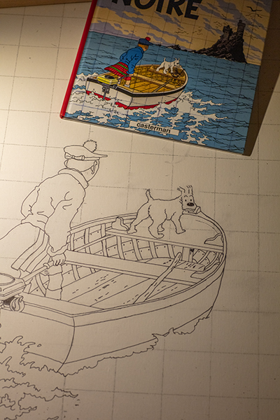
The scale drawing of a Tintin album is close to a 2:3 ratio and so the 24″ by 36″ format was almost a perfect fit. Below, you can compare the difference in scale between the original book and the drawing in the making.
A 2H graphite pencil for drawing on canvas will require less dedication when it comes to erasing the most obvious strokes and laying down the paint. The one I used (HB) was too dark and required more work than expected.
Reproducing a Tintin album leads us to progressively notice the genius of Hergé, this Belgian creator. We linger on his editorial choices, the composition, the angles. Drawing the rocks of the Black Island and their shadows is, in this respect, very revealing.
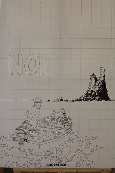
In the photo above, Tintin is heading towards the Black Island. We can feel him anxious, hence his slightly forward-leaning posture. He scans the island straight ahead. Hergé could have drawn him straight on his boat, confident. He chose to position him as an observer of a problematic situation. Similarly, Snowy looks at us with a worried expression and we have to repeat his expression exactly so as not to change the atmosphere of the scene.
Still missing are the black birds around the island, one of which seems to be heading straight for Tintin. You will see them in the next article: they are numerous, black and do not seem very friendly.
The sky, meanwhile, is not covered with pretty cumulus clouds but rather with streaky, tapered clouds invading the horizon, many of them dagger-like. Placed obliquely across the cover for added dynamism, Hergé also gave them a slightly circular shape.
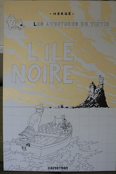
When painting the letters, one realizes the editorial choices of Hergé. Several of these features require attention, including the letter “O” which is not round but oval and leaning to the side. Also, Hergé aligns the two words of the title to the right and this has an impact when calculating the spaces between the letters.
In trying to reproduce a color exactly, one must make several attempts to discover the recipe. Often, three or four colors are combined to achieve a satisfactory result. And when we are satisfied with the tone, a surprise awaits us: once placed on the canvas, the acrylic paint changes color and becomes much darker as it dries. Trying to predict the result after drying is therefore a must.
(to be continued…)
Click on the link for more graphic novels and comics in my blog.