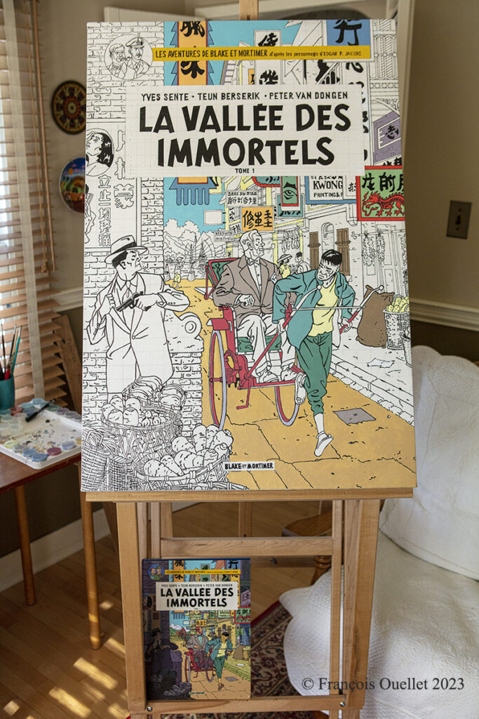
Painting of Blake and Mortimer : la vallée des immortels.
This is step 2 of the enlargement work I started from the Blake and Mortimer comic book: The Valley of the Immortals. The original album is at the bottom of the image above to give an idea of the original scale.
I want to use the entire 24 × 36 canvas space starting from a standard size comic book. I must modify the scale by adding an extra 10% to the height. However, when comes the time to draw the perfect circle located at the top left of the album, a standard 1:1 scale must be used so as not to transform the faces of the two heroes who are looking at us from the front. A painting made with two different scales does not produce a true copy, but it is still acceptable and realistic.
Trying to match an album’s original colour often requires mixing four different colours or more. Experience has shown that any newly created colour should be allowed to dry for several minutes on another canvas to ensure that it does not deviate too much from the desired colour, because it darkens when it dries. Mistakes are inevitable, however…
It looks as I will complete the canvas within the next few months, providing I work a few hours each day.
A third and final article will be published when the painting is completed.
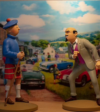
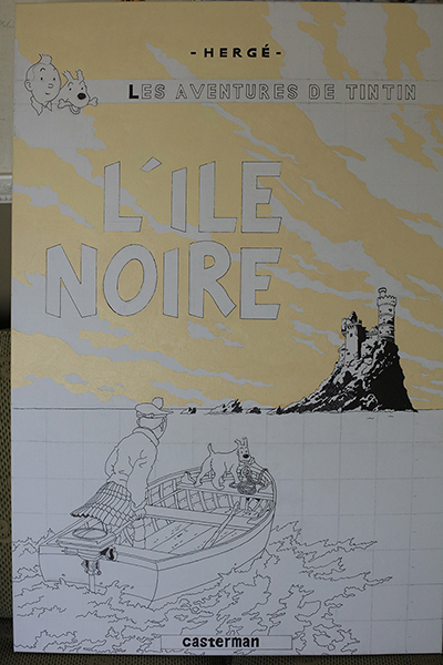
In the photo above, you may have recognized Tintin dressed as a Scotsman as he faces the evil Dr. Müller. These two characters are from the comic book Tintin and the Black Island. A majority of French speakers probably read this album in their youth. And, even as adults, some of us (myself included) have revisited this work by Hergé to get a fresher look at the album.
The restrictions and confinement of the Covid-19 pandemic allowed me to devote more time to drawing and painting. I decided to copy the cover of the Tintin album “The Black Island” using acrylic.
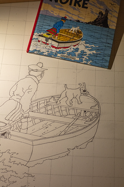
The scale drawing of a Tintin album is close to a 2:3 ratio and so the 24″ by 36″ format was almost a perfect fit. Below, you can compare the difference in scale between the original book and the drawing in the making.
Pencil and scale drawing of Tintin.
A 2H graphite pencil for drawing on canvas will require less dedication when it comes to erasing the most obvious strokes and laying down the paint. The one I used (HB) was too dark and required more work than expected.
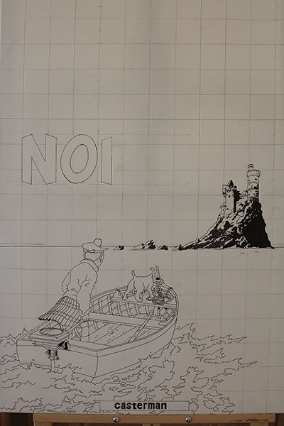
Reproducing a Tintin album leads us to progressively notice the genius of Hergé, this Belgian creator. We linger on his editorial choices, the composition, the angles. Drawing the rocks of the Black Island and their shadows is, in this respect, very revealing.
24×36 drawing of Tintin and the black island
In the photo above, Tintin is heading towards the Black Island. We can feel him anxious, hence his slightly forward-leaning posture. He scans the island straight ahead. Hergé could have drawn him straight on his boat, confident. He chose to position him as an observer of a problematic situation. Similarly, Snowy looks at us with a worried expression and we have to repeat his expression exactly so as not to change the atmosphere of the scene.
Still missing are the black birds around the island, one of which seems to be heading straight for Tintin. You will see them in the next article: they are numerous, black and do not seem very friendly.
The sky, meanwhile, is not covered with pretty cumulus clouds but rather with streaky, tapered clouds invading the horizon, many of them dagger-like. Placed obliquely across the cover for added dynamism, Hergé also gave them a slightly circular shape.
The sky is painted first on Tintin’s picture.
When painting the letters, one realizes the editorial choices of Hergé. Several of these features require attention, including the letter “O” which is not round but oval and leaning to the side. Also, Hergé aligns the two words of the title to the right and this has an impact when calculating the spaces between the letters.
In trying to reproduce a color exactly, one must make several attempts to discover the recipe. Often, three or four colors are combined to achieve a satisfactory result. And when we are satisfied with the tone, a surprise awaits us: once placed on the canvas, the acrylic paint changes color and becomes much darker as it dries. Trying to predict the result after drying is therefore a must.
Here are a few quotes drawn from the book “The Aviation Art of Keith Ferris”.
“I was told to draw, and keep drawing until I could master complete accuracy. I was not to be in such a rush to paint and render. Once drawing was under control there would be plenty of time to paint“.
“I was reminded that the aviation world was populated with people as well as airplanes and that I must learn anatomy and figure drawing and painting. For this I would have to go to school“.
The aviation art of Keith Ferris
“Never take employment in a job that will not in some way increase your knowledge of the graphic arts field“.
“The artist who expects his work to be reproduced should be familiar with the entire sequence of events of which art is only a part“.
“Pay close attention to the work of other artists and learn from the way they work. One quickly learns to recognize the difference between art that is good and art that is not“.
Front cover of the book “The Man and His Art” by R.G. Smith
« We had no television in those days, so my evenings were spent reading history or drawing, mostly airplanes”.
“[Lieutenant Commander Beaumont] influenced my life as an artist. […] He participated in Operation Deep Freeze in Antarctica. Where others saw only white and blue in this frigid area, Beaumont found wonderful color and conveyed same in his art. He added alcohol to his paints to prevent them from freezing as he worked in sub-zero temperatures for 30 minute intervals, retreating to a warmer area before going out again”.
“It was Beaumont who taught me composition, color balance, and how to look at a subject and translate the visual image to paper or canvas”.
“Beaumont emphasized it wasn’t necessary to reproduce an exact replica of a scene as long as the end result achieved dramatic impact”.
“Bob Poole taught me […] how to grey down vivid colors. He also taught me that by blending colors, I could add motion to aircrafts and add subtlety to harsh lines”.
“Understanding light and its effects is obviously critical to an artist […]. For instance, as the descending sun caught the side of a rusty tanker, it created a starkly bright copper tone. We learned that if we didn’t try to emulate that color on paper within 30 minutes, the light would be lost, and the rich copper tone would quickly change to a dingy, lifeless brown”.
“Aspiring artists want to know how to draw and paint, but very few want to take the time to learn”.
“Refrain from ever being satisfied with your work. Never stop rehearsing you craft. Every painting is another step in an endless learning curve. Achievement comes from hard work, discipline, and a constant program of practice and learning”.
“Accuracy requires study and thorough knowledge of your subject. […] Generally, more than 50 percent of the time invested in a painting went into research”.
Back cover of the book “The Man and His Art” by R.G. Smith
“As to planning a picture, my approach usually entailed making several sketches of ideas for the scene I wanted to create before deciding on the final composition”.
“Create the background first, knowing beforehand where you intend to place the aircraft, which should be the last phase of your painting”.
“My criticism of much of aviation art today is that many artists feel they must paint every rivet on an aircraft, or every line on a ship. It often appears as though some artists cut their aircraft from a photograph and paste it on the background”.
“[…] the eye and the brain do most of the work, connecting the dots and lines. In other words, you don’t have to include every detail, just a suggestion of detail”.
“Study the works of artists you admire, or whose style you want to emulate”.
“Some artists only see an airplane as a mechanical object. As a result, their depiction of them is mechanical, stilted portraits of aircraft rather than a picture with character, motion, or some measure of dramatic quality”.
“I’m not a complicated man and it has never taken much in the way of material things to make me happy. Most of my pleasures have come from my family, my career, my hobby, my books, and my friends. The wonderful experiences and opportunities that came my way were frosting on the cake”.
Title: The Man and His Art. R.G. Smith / an Autobiography (with Rosario “Zip” Rausa) Author: R.G. Smith with Rosario “Zip” Rausa Copyright: 1999 by R.G. Smith Edition: Schiffer Publishing Limited ISBN: 0-7643-0755-X
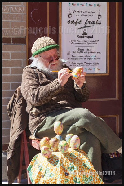
Tom White designing Easter eggs in Old Quebec (2016)
While I was walking in Old Quebec, I stopped to watch Tom White, a local artist, work on his hand-made Easter eggs. We talked for a few minutes and he agreed to let me take a picture of him at work.
For other photos on the province of Quebec and also Quebec City, click on the following links from my blog:
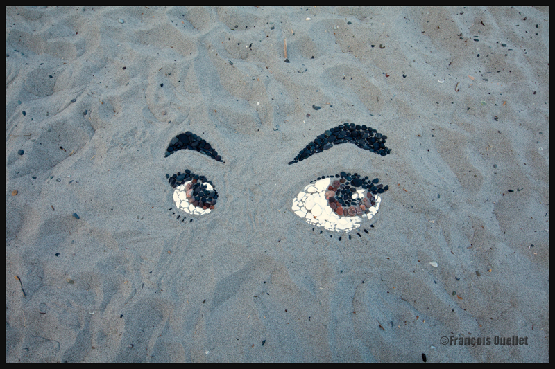
The picture above represents an improvised artwork that was done on Willows Beach in Oak Bay, a municipality in Victoria, British Columbia. The work, created during a summer afternoon in 2014, was made slightly out of the way from the main activity area of the beach and, by luck, was not damaged after its author left the beach.
However, during the evening, while taking a walk, I saw that a group of young people had installed a volleyball net on the beach, not far from where the artwork was located. The players often sent the ball very close to where the eyes where so I decided to take a picture to immortalize the work.
Shells and rocks of multiple colours had been assembled by a real artist to give the eyes an extremely realistic appearance, full of life. You may note that the artist took care of designing the eyes of different size, as it is necessery to add a three dimensional effect. Few white shells had even been added near the centre of the eyes to add the reflection appearance and bring the eyes to life. A real artist creation!