Categories
Graphic novels and comics

Author Guy Delisle’s superb new graphic novel

The new graphic novel from Guy Delisle: Pour une fraction de seconde.

Guy Delisle clearly hits the nail on the head with his new graphic novel “Pour une fraction de seconde – La vie mouvementée d’Eadweard Muybridge”. The book introduces us to a colorful character, famous for having advanced photography by leaps and bounds through the study of animal movement. These innovations consequently led to the development of cinema.

Guy Delisle’s drawings and script work perfectly. This time, the teaching of the story clearly takes over, but without ever boring the reader – on the contrary. A subject that could have turned out to be dry becomes fun and full of surprises. This book is a little more serious than the author’s usual offerings, but in a relaxed, well-presented form.

When someone stands out in an astonishing way in a field, we often hear the expression: “He was born to do that”. This is certainly not the case with Muybridge. And yet, he succeeds where many fail or lack the tenacity and character to face adversity.

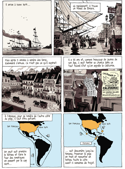
Before achieving fame for his success in photography, the main character took many paths, some of them seemingly contradictory. He started out as a bookseller and became entrepreneur, genius inventor, assassin, businessman, writer and lecturer. He traveled extensively to further his projects. That took him to England, the United States, France, Germany and Italy.

A page from Guy Delisle's new graphic novel "Pour une fraction de seconde"
A page from Guy Delisle’s new graphic novel “Pour une fraction de seconde”

As a result of Guy Delisle’s reputation as a cartoonist in Quebec and France, he knows he can choose any subject he is passionate about without risking to lose his public. There is undoubtedly a lot of research in his new book. In a way, he’s doing us all a favor, as we learn a bit of history while we’re entertained.

Along the way, you’ll meet the likes of Tesla, Edison and the Lumière brothers, and discover who was behind the name “Stanford” at the famous American university.

Happy reading!

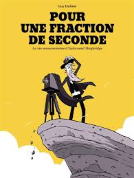
Title: Pour une fraction de seconde — La vie mouvementée d’Eadweard Muybridge

Author: Guy Delisle

Publisher: © 2024 Éditions Delcourt

ISBN: 978-2-413-08585-0

Click on the link for other graphic novels and comics on my blog

Categories
Graphic novels and comics

Tintin and the black island (2 of 2)

Acrylic painting in progression of Tintin and the Black Island.

Welcome to the second and last part of Tintin and the Black Island. The photo above shows the clouds almost completed. The yellow sky was a problem, because once on the canvas, the color became too dark as it dried. I had to find a recipe for a lighter yellow than the one on the original cover so that as it dried the color would get darker and match the color of the album.

Details of the castle of Tintin and the black island.

The photo above shows the progression of the castle and the island, but this time with the birds as a bonus. Hergé drew a lot of black birds around the castle, which adds to the sinister look of the place. But he also thought of drawing two larger birds in the foreground, of which one seems to be heading towards Tintin.

Painting in progress of Tintin and the Black Island.

The painting is progressing rapidly. I have already worked on it for about a hundred hours to get to this point. The sea has received all its touches of black paint to form the appearance of waves.

Scale copy of Tintin and the Black Island.

The picture above gives an idea of the size of the painting. The painting must often be placed on a table to paint the elements that require great precision.

In the background of the photo, a journalist from the Canadian news channel RDI is seen on television. He is commenting on the street blockage situation in Ottawa by truckers during the Covid-19 pandemic. The protesters fight for their rights, but do not respect the rights of the citizens of Ottawa who, for weeks, are trapped in their neighborhoods. The Canadian government finally put an end to the situation by invoking the Emergency Measures Act with the added bonus of a $306 million lawsuit brought by residents against the protesters.

24x36 picture of Tintin and the Black Island completed.
24×36 picture of Tintin and the Black Island completed.

Above is the completed painting. You will notice that the white tones of the boat differ on the back and side. There is white combined with black and a touch of yellow for the side of the boat, rather than the pure white required for the back. It took some experimenting with colors to finally realize the need for yellow.

The waves flattened by the boat are now just rounded bubbles behind the boat. However, on the sides, the appearance differs because the movement of the boat breaks the waves: Hergé therefore ensures a different treatment of the foam. He thought of everything, as usual!

It is now time to move on to another project. I am not sure yet, but I am thinking of “Blake and Mortimer” these heroes of Edgar P. Jacobs, a great master of the clear line style who initially worked with Hergé.

Glénat just published a book titled “Edgar P. Jacobs le rêveur d’apocalypses”, if you want to learn more on the subject…

Click on the link for more graphic novels and comics on my blog.

Categories
Graphic novels and comics

Tintin and the black island (1 of 2).

Figurines of Tintin and Doctor Müller.

In the photo above, you may have recognized Tintin dressed as a Scotsman as he faces the evil Dr. Müller. These two characters are from the comic book Tintin and the Black Island. A majority of French speakers probably read this album in their youth. And, even as adults, some of us (myself included) have revisited this work by Hergé to get a fresher look at the album.

The restrictions and confinement of the Covid-19 pandemic allowed me to devote more time to drawing and painting. I decided to copy the cover of the Tintin album “The Black Island” using acrylic. 

The scale drawing of a Tintin album is close to a 2:3 ratio and so the 24″ by 36″ format was almost a perfect fit. Below, you can compare the difference in scale between the original book and the drawing in the making.

Pencil and scale drawing of Tintin.

A 2H graphite pencil for drawing on canvas will require less dedication when it comes to erasing the most obvious strokes and laying down the paint. The one I used (HB) was too dark and required more work than expected.

Reproducing a Tintin album leads us to progressively notice the genius of Hergé, this Belgian creator. We linger on his editorial choices, the composition, the angles. Drawing the rocks of the Black Island and their shadows is, in this respect, very revealing.

24x36 drawing of Tintin and the black island
24×36 drawing of Tintin and the black island

In the photo above, Tintin is heading towards the Black Island. We can feel him anxious, hence his slightly forward-leaning posture. He scans the island straight ahead. Hergé could have drawn him straight on his boat, confident. He chose to position him as an observer of a problematic situation. Similarly, Snowy looks at us with a worried expression and we have to repeat his expression exactly so as not to change the atmosphere of the scene.

Still missing are the black birds around the island, one of which seems to be heading straight for Tintin. You will see them in the next article: they are numerous, black and do not seem very friendly.

The sky, meanwhile, is not covered with pretty cumulus clouds but rather with streaky, tapered clouds invading the horizon, many of them dagger-like. Placed obliquely across the cover for added dynamism, Hergé also gave them a slightly circular shape.

The sky is painted first on Tintin's picture.
The sky is painted first on Tintin’s picture.

When painting the letters, one realizes the editorial choices of Hergé. Several of these features require attention, including the letter “O” which is not round but oval and leaning to the side. Also, Hergé aligns the two words of the title to the right and this has an impact when calculating the spaces between the letters.

In trying to reproduce a color exactly, one must make several attempts to discover the recipe. Often, three or four colors are combined to achieve a satisfactory result. And when we are satisfied with the tone, a surprise awaits us: once placed on the canvas, the acrylic paint changes color and becomes much darker as it dries. Trying to predict the result after drying is therefore a must.

(to be continued…)

Click on the link for more graphic novels and comics in my blog.